Where the work tells the story. Dive into a showcase of work shaped with purpose, powered by teamwork, and designed to move people.
The Trader Program | White Cap


Original Visual Framework
THE CONCEPT
The Trader program spans multiple channels, including the Contractor Trader magazine, email, homepage banners, and in‑store digital signage.
THE CHALLENGE
The original design was visually crowded, with minimal white space separating content, which made the information difficult to read. Inconsistencies across channels — paired with the need to build each asset in different software — added unnecessary complexity and significantly increased production time.
What I did
Design Strategy • Rebranding • Production Optimization
Layout elevated for Faster Navigation
THE CONCEPT
I added more white space for a lighter, cleaner layout that puts the focus on the deals and helps the cover stand out among other publications. Introduced bold, intuitive color‑coding so customers can spot the right offers at a glance.
THE RESULT
Cohesive Campaign Story: Unified the design across channels for a consistent, recognizable look that stays top‑of‑mind
Faster production process: The consistent layout across channels and using the same software reduced production time by 30%


Institutional Advertising


Original Visual Framework
THE CONCEPT
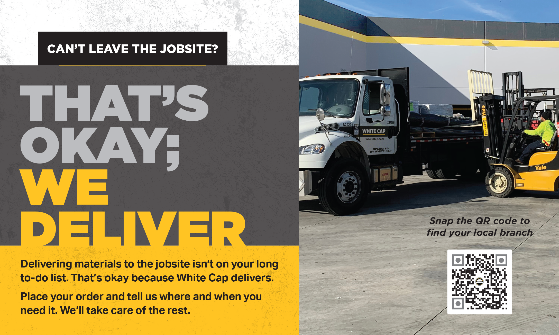
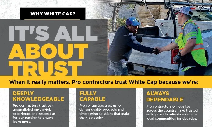
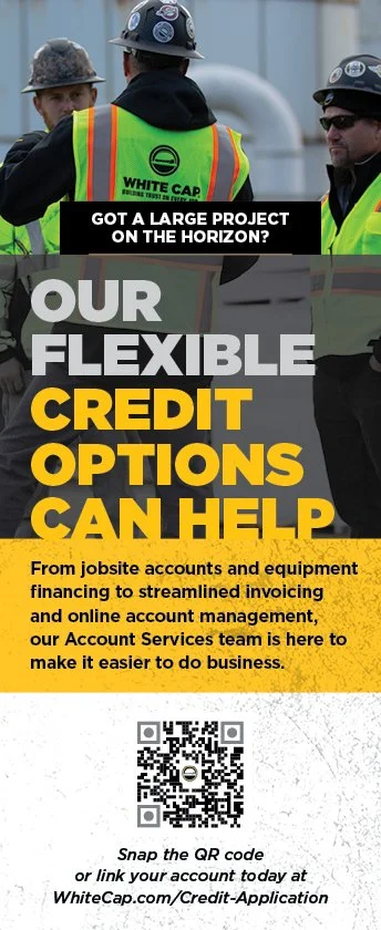
White Cap needed institutional advertising that went beyond product promotion. The goal was to communicate the company’s values, mission, and commitment to social responsibility in a way that resonated with customers, stakeholders, and the broader public.
THE CHALLENGE
Creating a “look and feel” that felt authentic, trustworthy, and aligned with the brand’s identity as a dependable partner in the construction industry.
What I did
Design Strategy • Branding • Production Optimization
Shaping Perception Through Visual Identity
THE CONCEPT
I developed a creative strategy that highlighted real people, real jobsites, and the real impact White Cap has on communities. By combining strong storytelling with clean, modern design, I ensured each ad reinforced the brand’s core values while remaining flexible enough to work across multiple channels and formats.
THE RESULT
The resulting campaigns strengthened White Cap’s reputation as a trusted, socially responsible leader in the industry. The ads helped build long‑term brand loyalty, increased positive sentiment, and established a consistent, recognizable voice that supports the company’s mission and values.
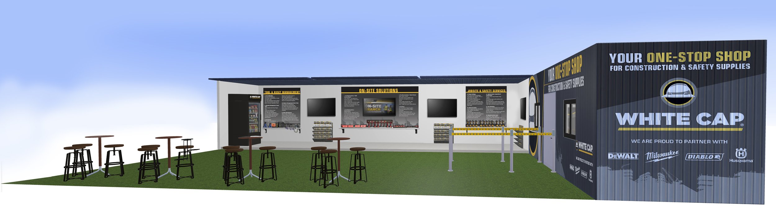
On-Site Solution | QTS Jobsite
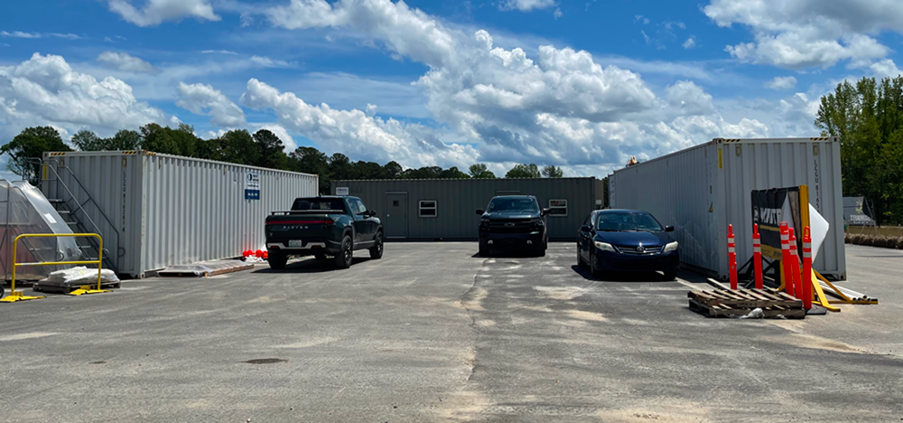
The original design
THE CONCEPT
On-Site Solutions is a White Cap program that offers from inventory and asset management to safety programs and procurement integration, to help contractors reduce costs, save time, enhance safety, and improve workflow.
THE CHALLENGE
Design a modern, cohesive brand system that could stand out in busy, high‑visibility environments and remain instantly recognizable from a distance.
What I did
Design Strategy • Rebranding • Production Optimization
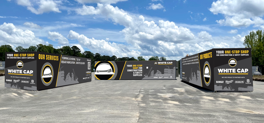
Rebumping the Design
THE CONCEPT
I focused on simplifying the visual language—using bold geometry, high‑contrast color blocking, and clean typography—to ensure quick recognition in real‑world conditions. A modular layout allowed the system to scale across different container sizes, while field testing informed adjustments to visibility, durability, and legibility.
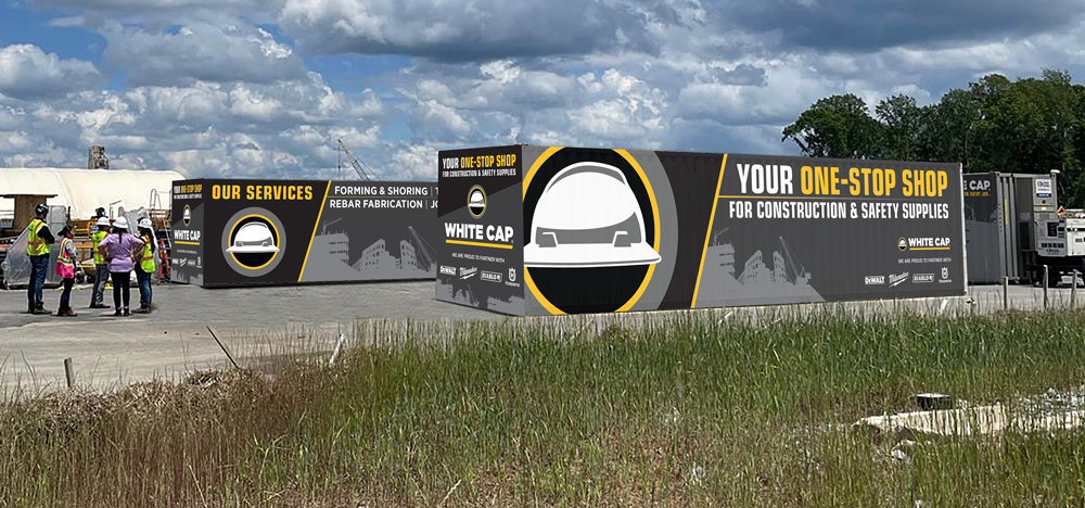
THE RESULT
The final design delivered a contemporary, high‑impact look that elevated White Cap’s presence on jobsites. The branding is clear, consistent, and unmistakable, even from long distances.
A stronger on‑site brand presence, improved visibility and a scalable system that reinforces White Cap’s identity as a modern, tech‑enabled partner.